top of page


Campus Benefits
Redesigned the website for Campus Benefits, an employee benefits company serving school districts and public entities, to simplify navigation, clarify its story, and strengthen credibility with prospects.
Role: In-house UX/UI & Web Designer, working with company leadership and an external development team
Project type: B2B website redesign
Timeline: November 2024 - May 2025
Outcome: Launched the restructured website during the company's move from WordPress to HubSpot
Responsibilities: Content audit, information architecture, visual design, stakeholder collaboration, developer handoff, and implementation review
-1.webp)
Problem
Campus Benefits’ website had useful information, but it did not clearly represent the company. Content was repetitive, important pages were difficult to find, employees were not featured, and some information was outdated or misleading. This made the website harder to navigate and the company harder to understand.
Where it All Started
When a coworker and I interviewed at Campus Benefits, neither of us could tell what the company did from its website. We had to search online to understand the services and look up employees on LinkedIn to see who worked there. We shared this with leadership, and it became a starting point for the redesign.
Make the website easier to understand and navigate while building credibility and keeping the company’s existing brand.
Project Goal
Simplifying the Navigation
I restructured the site so key pages were easier to find. Outdated pages were removed, Contact and Testimonials moved out of the "More" dropdown, Our Philosophy was renamed Our Company, and a new Meet the Team page was added.
Before: Key pages were buried in a "More" dropdown alongside outdated content.
After: A simple navigation with Contact always visible.

After

Before

Looking back: I would've kept the phone number visible. Campus Benefits builds and keeps client relationships through real-time conversations, and an icon makes that path less obvious.
Homepage Order
The old homepage asked visitors to schedule an appointment right after the hero, before they knew who Campus Benefits was. I proposed moving the mission statement up and the contact prompt to the bottom of the page, and stakeholders approved both changes. The goal was to let visitors learn about the company first, then give them a clear next step once they're ready.
Before
After


The contact prompt now sits at the bottom of the page, after the sections that introduce Campus Benefits.

Testimonials Section
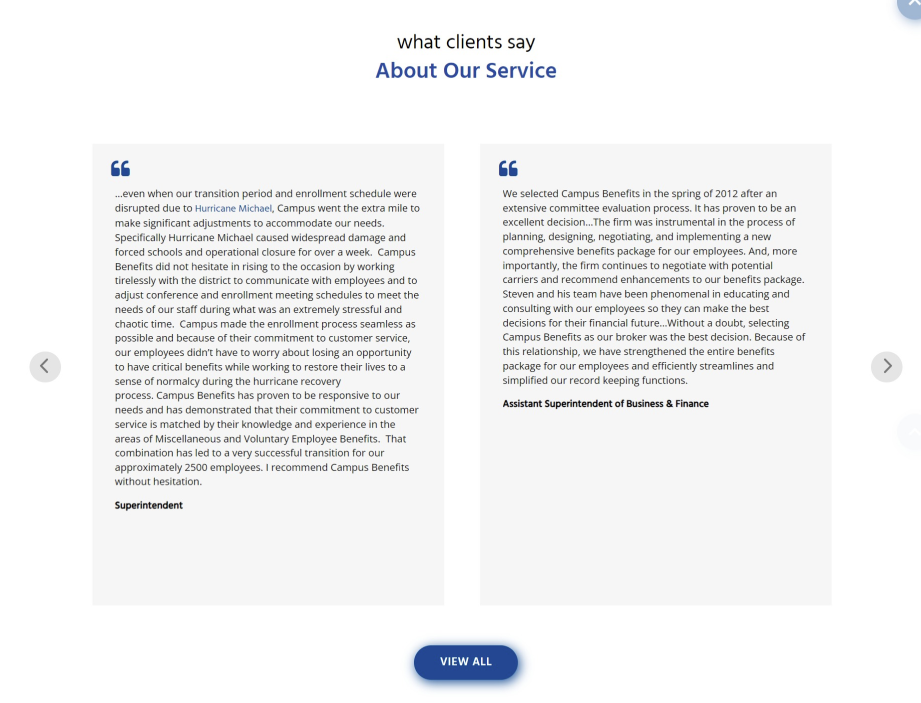
The original testimonials were detailed but too long to scan. To keep the impact of school administrators' stories in less space, I added a client video where they describe how Campus Benefits has helped them, and shortened the written quotes.
Before: Lengthy written testimonials were difficult to scan
After: I added a client video and shortened the written testimonials to make client feedback quicker to scan.

Understanding the Company Before
Scheduling an Appointment
Navigation
1. Put Contact where people look for it. Contact was hidden inside the "More" dropdown. I moved it into the main navigation so visitors have a direct path to the form.
2. Simplified the header. To reduce clutter, I replaced the written phone number and email with icons.
After: The “Who We Are” section tells the company story once.
Reframing the Company Story
I recommended combining Our Philosophy, The Company, and The Heritage into one section, since all three repeated the same story. Leadership agreed to keep The Company content and rename it Who We Are. During the project, Campus Benefits also began expanding into city governments, so we updated the language from "public schools" to "educational systems and public entities" to reflect who the company now serves.
Before: The company story was split across three overlapping sections.
.png)

Putting Faces to the Company
The website didn't introduce the team, so prospective clients and new hires had no way to put faces to names, just as my coworker and I had experienced. I proposed a Meet the Team page with photos, names, roles, and short bios. Stakeholders supported the idea and arranged professional headshots.


Keeping profiles scannable
Names and roles remain visible in the grid, while biographies open in a pop-up so visitors can learn more without making the page difficult to scan.

Keeping Content Accurate and Current
During the content review, I identified two pages that were difficult to maintain or did not accurately reflect the company’s operations. I recommended removing them, and stakeholders approved both changes.
News & Events - Removed
The page required ongoing updates to remain current. After discussing the upkeep involved, we removed it rather than keeping content that could become outdated.
Educational Resources - Removed
This page included resources for states outside Campus Benefits’ service area, which could confuse visitors about where the company operates. We removed it to keep the website accurate and relevant.


Collaboration & Implementation
I worked with stakeholders through three rounds of revisions and collaborated with developers in Figma. We used comments to clarify content decisions, maintain brand consistency, and resolve implementation questions before launch.


"I had the pleasure of working with Page on the Campus Benefits websites. She was a great client to work with—professional, communicative, and very collaborative throughout the project. She provided clear direction and thoughtful feedback, which made the overall process smooth and productive. I truly appreciated her trust in my work and her positive approach to collaboration. It was a pleasure working with her, and I would be happy to work with her again."
- Govindasamy Sekar, Engineering Manager, BillionApps
Built for Credibility, Not Traffic
Campus Benefits wins business through door-to-door outreach and referrals, so the website's main job is to build credibility and brand presence.
HubSpot data, May 5, 2025 – September 2, 2026
-
62% of homepage views were entrances, which supports prioritizing the homepage.
-
4.43% of Contact page visitors submitted the form.
Reflections
The redesign was less about reinventing Campus Benefits’ brand and more about making the information they already had easier to understand and navigate. The company had established branding and valuable content, so I focused on identifying where information could be condensed, reorganized, clarified, or removed rather than redesigning everything simply for the sake of change.
Leadership wanted the site to feel clean and professional and gave me considerable flexibility in determining the visual direction. Because the stakeholders were not designers, feedback focused primarily on whether the content accurately represented the company and whether the final experience felt clear and polished.
This project taught me that simplifying can go too far. Replacing the phone number with an icon made the header cleaner, but it hid the contact method this company relies on most. Next time, I'd weigh every "cleaner" decision against how the business actually talks to its clients.
I also would have conducted usability testing to see whether people could understand what Campus Benefits does and whether introducing the team helped build credibility. Because of the project timeline, I wasn't able to test these decisions with users before launch.
Live website: Campus Benefits
bottom of page