top of page


Problem
Beauty by Anh offered makeup, hair, lash and brow services, but clients had difficulty finding clear service information and understanding how to book (inquiry form vs. Square). This was especially confusing for bridal parties who wanted to book multiple people.
Reorganize the website so clients could easily understand available services, find the information they needed before booking and have easy access to booking multiple people for services.
Project Goal
.png)
.png)
.png)
Looking at the Competition
I looked at three comparable beauty service websites to understand how they solved for similar needs.
Patterns that informed my design decisions
1. Clear brand voice builds credibility
Consistent messaging helped established businesses feel more professional and trustworthy.
2. Provider information builds trust
Introducing the owner and staff helped customers understand who would be providing their service.
3. Flexible booking supports different needs
Competitors made it easier to navigate services and determine the appropriate booking path.
4. Clear portfolio categories make services easier to explore
Organizing examples by service type helped customers quickly find work that matched what they were interested in.
Understanding the Booking Experience
I interviewed five people with experience booking beauty services online to understand what information they needed before committing to an appointment and where uncertainty typically occurred in the booking process.
Clarity before commitment
Users need service details, pricing, availability, duration and fees to determine whether a service fits their needs before booking.
Trust & credibility
Provider experience, photos of past work, reviews and business information help users feel confident about who they're booking.
Booking confidence & control
Users want available dates and times, provider information, expected cost and appointment details before confirming. 4 of 5 participants valued knowing who they were booked with.
Clear information hierarchy
Users want enough information to make an informed decision without being overwhelmed by excessive content, too many options or unclear navigation.
"If I feel like I’m going in circles trying to find the information I’m looking for, that makes it unpleasant. Also, if there is lack of information or photos on the website, I don’t really trust that. What makes it pleasant is that I find what I’m looking for easily."
- Interview Participant


Turning Research into Design
Each screen was built around a research priority, and callouts show where client feedback changed the design.
(Click to enlarge)
Refining the Navigation & Booking Experience
Research showed that users wanted service details before booking, so I initially included service information within the Book Now experience. After the initial review of the low-fidelity screens, the client preferred to separate service information from the booking. I revised the navigation by creating a Services section.
Business Constraint: Makeup and hair appointments required an inquiry and consultation before confirmation, while lash and brow services could be booked directly through Square.

Visual Direction
The client wanted the website to feel feminine and minimal, with neutral colors and greenery throughout. She also provided a light pastel color palette as a starting point.
Accessibility Constraint: Some of the original color combinations did not have enough contrast. I tested darker colors that still fit with the client's vision but were easier to read.
Typography: I chose Sacred Valley to complement the style of the existing logo and paired it with Poppins for the body text.
Outcome: The client approved the updated color palette and typography.


High-Fidelity Designs
*Click on the screens to view in full detail


Solving Multi-Person Booking
Bridal parties can now submit one inquiry form instead of multiple ones.

Testing the Prototype
I tested the high-fidelity prototype with five participants to see whether they could navigate the site, understand the service information and complete the booking flow without confusion.
Navigation was intuitive
All 5 participants found the website intuitive to use, and participants relied heavily on the navigation to move through the site.
The overall experience felt familiar
Participants were able to navigate the site and dropdown menus easily, describing the experience as similar to other booking websites they had used.
The homepage needed to represent more services
1 of 5 participants felt the hero image made the business appear too focused on bridal services, revealing an opportunity to better communicate the range of services offered.
Some content interactions could be improved
Individual participants identified opportunities to improve the staff bio interaction, review carousel, and readability of centered text.
"I really liked the colors and layout of the pages. I had trouble finding a makeup service for my wedding, and would have liked to see a site like this that clearly laid out the prices and cancellation policy and had an easy way to add another person for the service."
- Usability Testing Participant

Iteration 2
Making provider information easier to compare
Findings:
1 of 5 participants found the hover interaction limiting because only one staff bio could be viewed at a time.
Before

Change:
I replaced the hover interaction with a click interaction, allowing multiple bios to remain visible so users could compare providers more easily.
After

Before
After
Design Iterations
Usability testing revealed ways to improve how users understood the business and interacted with the site. I prioritized changes that improved service clarity and made information easier to compare.
Iteration 1
Clarifying the range of services
Findings:
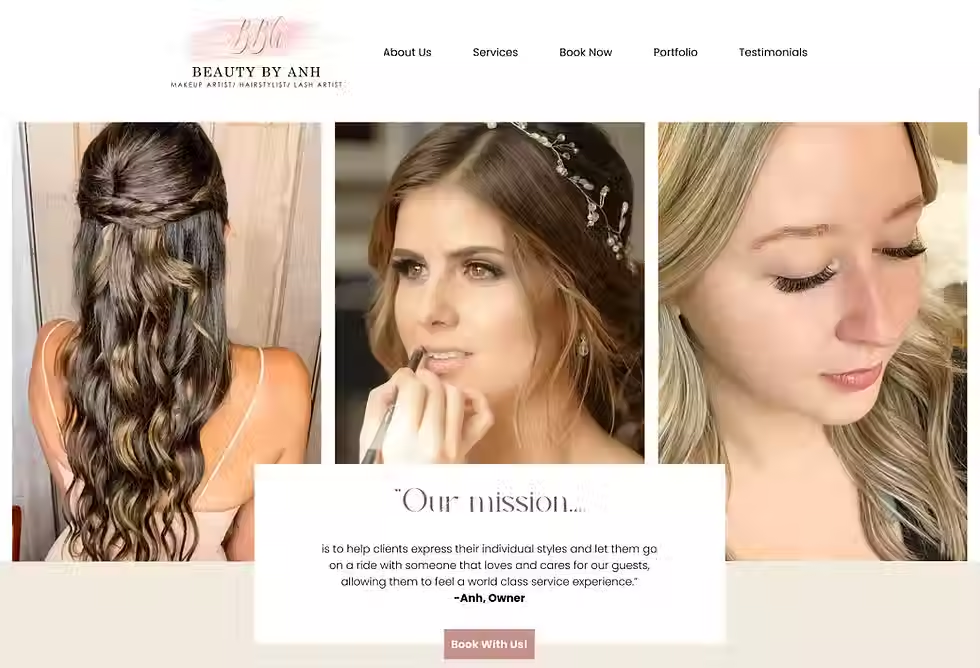
1 of 5 participants felt the original bridal hero image made the business appear primarily focused on bridal services.
Change:
I replaced the single bridal image with three images representing different services, helping communicate the broader range of services offered.
Even though only one participant raised it, the hero image could affect how every visitor would understand the business.
Final Prototype
What the Client Implemented
Live website as of August 2026.


Reflections
Balancing user needs with business constraints
This project confirmed that the ideal user experience is not always the solution that gets implemented. While research supported a more streamlined booking experience, the client’s existing processes required different paths for different services. Working within those constraints taught me to adapt my recommendations while still advocating for clarity and ease of use.
Measuring usability more intentionally
If I were to redo parts of this project again, I would be more mindful of gathering metrics. While participants were able to navigate the site and complete the booking flow, tracking metrics such as task completion, errors and points of hesitation would have given me stronger evidence for evaluating the design.
After the project
The client later implemented key recommendations, including the Services navigation, the visual direction, and the Makeup & Hair / Lashes & Brows structure across her services, portfolio, and reviews. Service details live on their own pages, and her booking flow shows pricing before the inquiry form, which collects bridal party headcounts. Staff bios were not included as the business evolved.


Beauty By Anh
Redesigning the booking experience and information architecture for a multi-service beauty business.
Role: Sole UX/UI Designer
Project type: Freelance B2C website redesign
Timeline: September 2022 - October 2022
Outcome: Select design recommendations implemented
bottom of page